ART DIRECTION
School Project
2025
-
Samir Kuronen, project manager
Jenna Kuusimäki, project manager
Jesse Meritähti, art director
Laura Siibe, art director
Elli Vähämäki, assistant AD
Karoliina Humppi, production AD
Emmi Jahnsson, copywriter
Alvari Juhola, copywriter
Mea Nyman, copywriter
Anni Sirén, copywriter
Luka Hacklin, photo editor
Sofia Santanen, photo editor
Mette Tikkanen, photo editor
Juha Pohjola, editor
Mika Seppälä, editor
Cover typography by
Luka Hacklin
Alvari Juhola
Samir Kuronen
Jenna Kuusimäki
Jesse Meritähti
Sofia Santanen
Laura Siibe
Anni SirénCovers and illustrations by
Jesse Meritähti
Collage by
Anni Sirén
Mea Nyman
Software:
Adobe Photoshop
Adobe InDesign
On Visual Design Project course, each class designs an art book expressing their ideas through creative writing and visually striking spreads, with every student interpreting the book’s concept in their own style.
As lead art director, I was in charge of the book’s concept and visual coherence, defining the overall aesthetic including typography, layout and color scheme. Additionally, I designed the covers and worked closely with our teams of project managers, copywriters, production and photo editors. The book was printed by Totem in Inowrocław, Poland, featuring open-spine binding and embossed cover elements.
Designing the book started with choosing its concept. We debated whether to focus on our group dynamics or a more open theme. Eventually we narrowed our thoughts down to two options — the first being the concept of home; is it a concretic space, a passing moment, people, perhaps comfort food? Additionally, I pitched the concept of ‘vieras’ (eng. foreign, unfamiliar, guest, alien), as I felt it would be a concept ambiguous enough to allow everyone to interpret it in their own way. Out of these two contenders, we voted to proceed forward with the latter — which also became the title of the book.
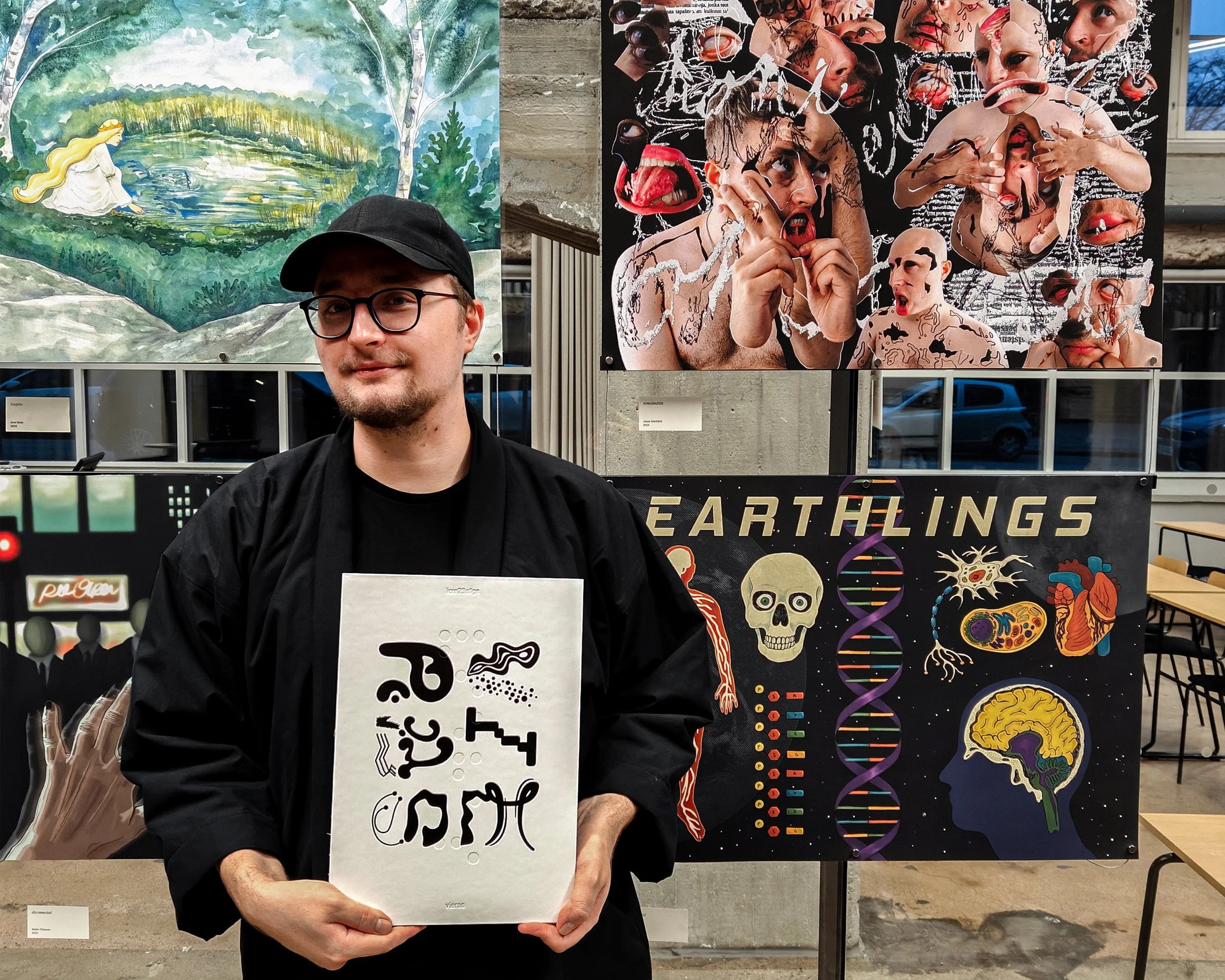
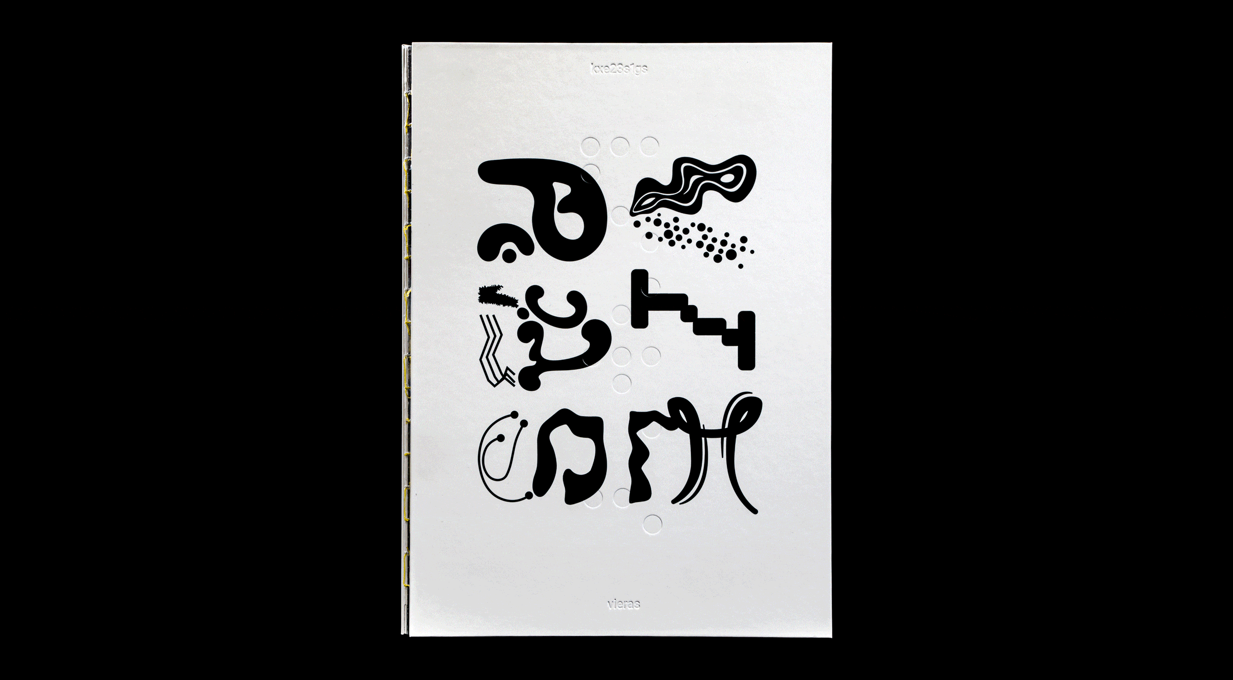
Designing the covers, I aimed for a minimal cover with only typography on blank paper. My interest in experimental typography made the cover a perfect opportunity to collaborate as a group, with the intention of keeping the book's title slightly concealed. After my initial sketches were met with enthusiasm, I asked participating volunteers to design fragments of letters without knowing what others created. I then assembled the pieces into the final characters, editing them only if necessary. The outcome worked perfectly. The back cover features only the Metropolia University of Applied Sciences logo in black.
I had suggested numbering the chapters of the book instead of naming them, in addition to which I had also pitched using braille as a visual element throughout the book, taking the concept of ‘foreign’ even further as decoding it requires specific knowledge and enables hidden messages. Braille appears both as debossed text on the front cover and occasionally as running footers at the bottom of a page, indicating chapter titles alongside page numbers. The title of the book and our group identifier code KXE23S1GS are also debossed on the cover.
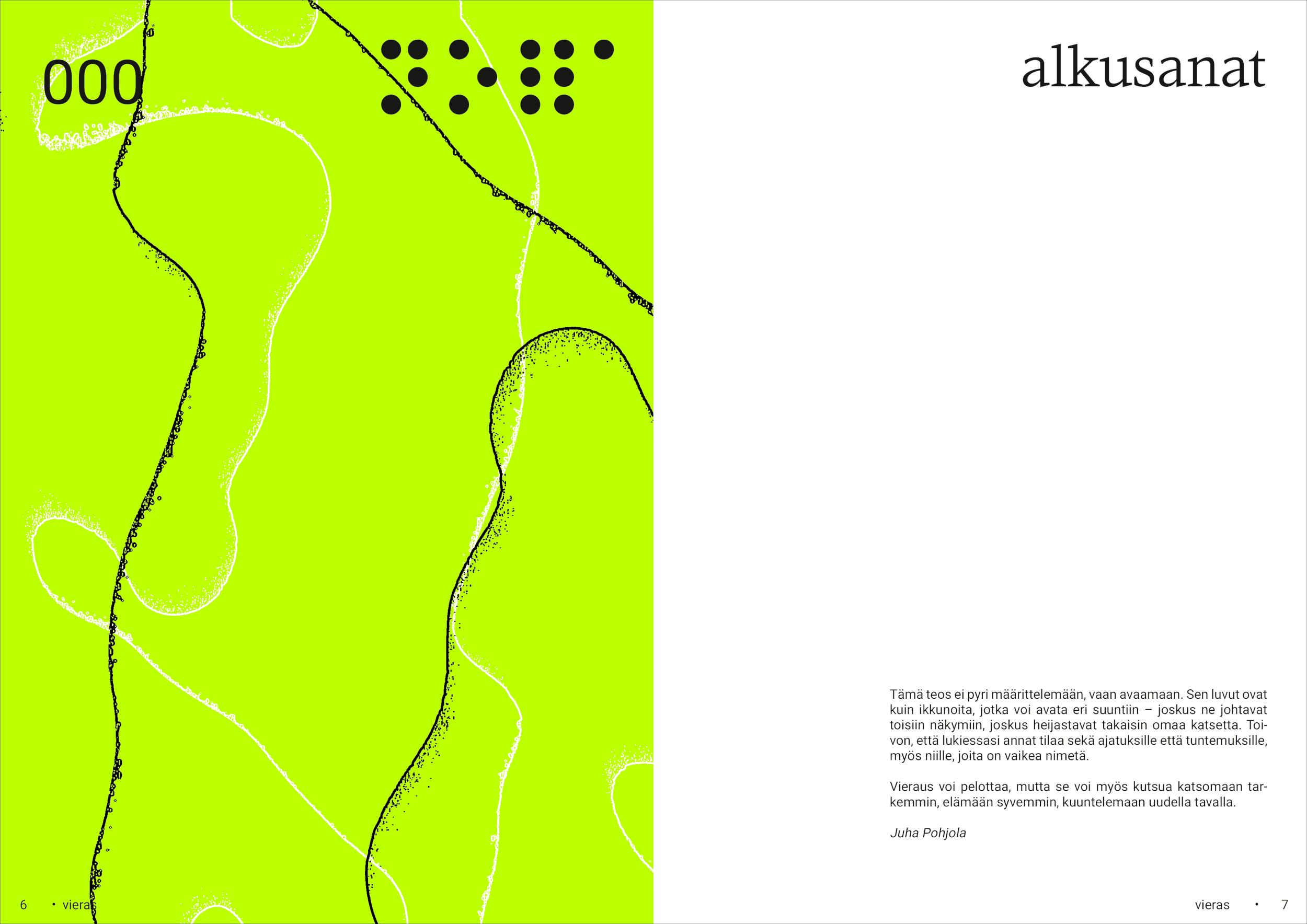
The book is divided in two parts. The first half features forewords by our teachers Juha Pohjola and Mika Seppälä, followed by spreads designed by each student. As art director, I was very adamant on not explaining the artworks too much, leaving room for the reader’s own conclusions. The pieces were grouped by tone and visual cues into chapters, each introduced by a standalone piece of creative writing that did not define or explain what followed, but merely hinted at.
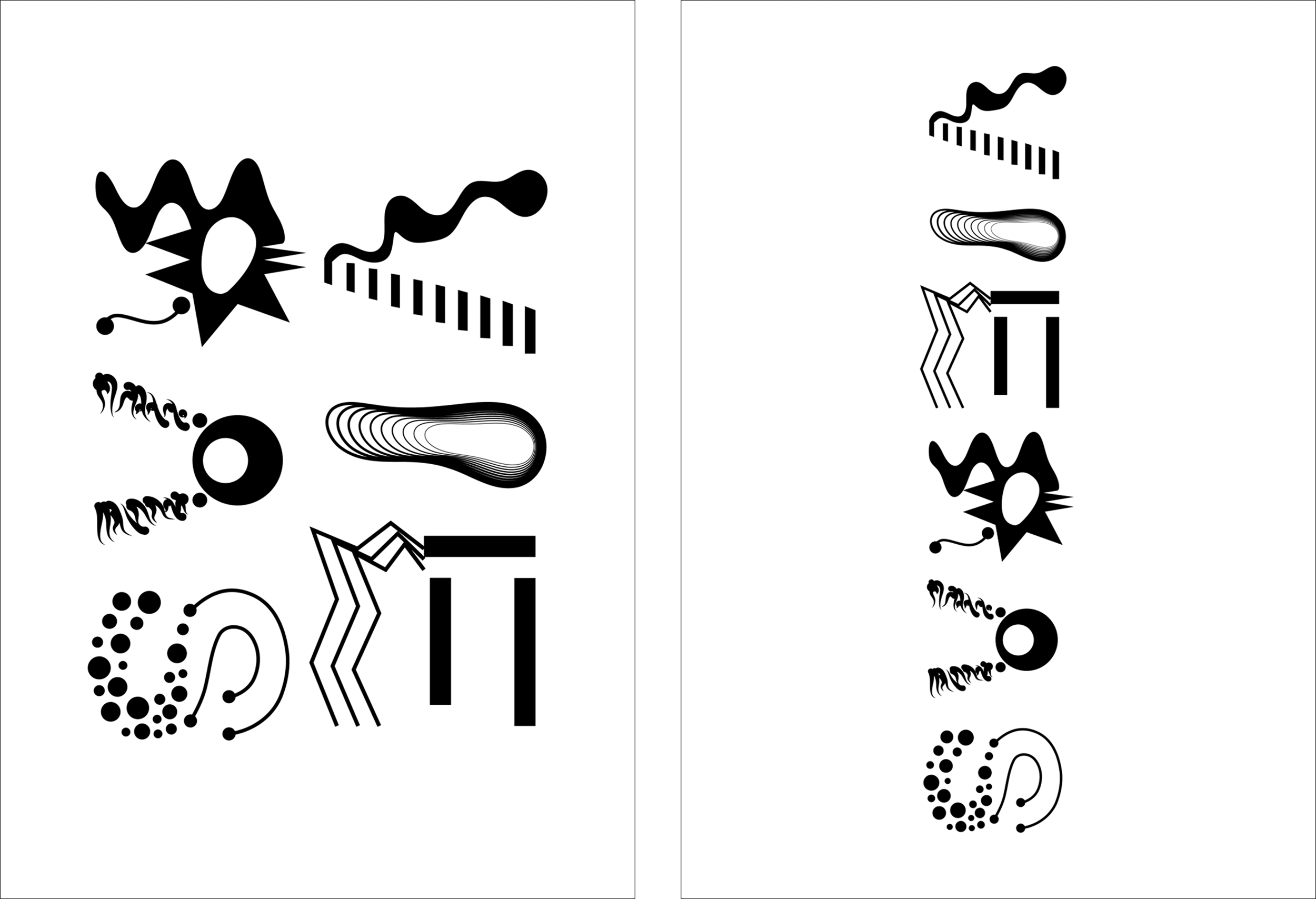
Defining the aesthetic of these spreads was a key factor in designing the overall aesthetic of the book. I wanted the left page to feature abstract illustrations, whereas the right page would feature a significant amount of white space surrounding the text. I explored several options for the illustrations, some of them featuring rough sketches by our assistant AD Elli Vähämäki.
We voted for a style of abstract shapes drawn with black and white strokes on a solid accent color, going with bright yellow to match the book’s binding thread we had chosen. I then produced more of these illustrations for spreads throughout the book, working with different effects and displacement maps in Adobe Photoshop to achieve the outcome.
In typography, I eventually decided on serif typeface IvyOra Text (designed by Jan Maack, Ivy Foundry) for main headings and table of contents, whereas sans serif typeface Heebo (designed by Oded Ezer, Google) was used in drop caps and body text. I aimed for elegant and sophisticated main headings that would compliment the open-spine binding, not dominating the book’s aesthetic too much, while Heebo provided a simple and neutral balance.
For my own spread in the book, I took portraits of myself and manipulated them in Photoshop, creating various more or less disturbing and distorted portraits which I then used to put together a mixed media inspired collage. I’ve always found distorted portraits fascinating — works by Jesse Kanda and Jordan Hemingway to name a few —, and I’ve also explored using distortions in my own portraits in the past. In addition to some asemic writing that the reader could create their own meaning for, I also hid some messages, deliberately making them hard to read — the reader can only guess at best, unless they somehow manage to piece the text together.
Some members of our group wanted to include accompanying text with their artwork. To feature these without distracting from the pieces, I drew inspiration from a catalogue I saw on social media and created a list of works at the end of the first half of the book. The list details page numbers, creators and artwork titles, and for pieces with accompanying text, also features a small image of the work and the text itself. The image and text are centered to interrupt the otherwise rigid grid, adding contrast and interesting dynamism.
For my own artwork, I wrote the accompanying piece of text (translated from Finnish):
“A soft hand pierces the eyes of my face, gentle and soulful. The flesh of someone warm and infinitely loving is torn open — heavy masses of form spill out of my chest, entwine around me, and are absorbed back into me. I am only a bystander, whose actions do not affect the course of events; and nothing can separate me any longer from the flesh that, guided by my heart, continues its life beat by beat.”
The second half of the book is dedicated to its creators, with copywriter Emmi Jahnsson contributing two texts: one reflecting on how we all began as strangers, and another on the friendships and group dynamics that have formed — and how some of us may become strangers again as our paths diverge. We collected photos from our events and gatherings, and Mea Nyman and Anni Sirén created a collage using some of them.
The final pages of the book feature afterwords by our teacher Kai Talonpoika, featuring his expressive wordplay and humor.
Final tasks included designing the pages for publication details and table of contents. Inspired by film posters, I proposed a credit-block style for listing team members and their respective roles instead of a regular list. For the table of contents, I suggested doing something more experimental to compliment the covers and the concept of the book, placing page numbers and creators’ names on oval shapes, reminiscent of planets that orbit the chapter titles written in braille — each section of the book being their own galaxy.
Work on the book began in spring 2025 and concluded in fall, as students had June through August to complete their artworks. During this time I refined the typography, layout and illustrations while also working on my own spread. Given my role as art director, I worked closely with project managers Jenna Kuusimäki and Samir Kuronen on arrangements with the print and led regular check-in meetings. When Samir left for an exchange program, I stepped in to support Jenna in finalizing things with the print.
Once the artworks were completed in late August, Karoliina Humppi helped format them along with texts from copywriters Emmi Jahnsson, Alvari Juhola, Mea Nyman, and Anni Sirén, while photo editors Luka Hacklin, Sofia Santanen and Mette Tikkanen ensured the images met print requirements.
‘Vieras’ was our first experience creating a printed book and the first project our entire class completed together as one team. For me, the book became a passion project, fulfilling my desire to explore art book design. We were thrilled to experiment with the open-spine binding — something no previous class had done — and I was especially excited about incorporating debossed elements on the cover.
To celebrate the completion of the book, project manager Jenna Kuusimäki and I organized an exhibition of the book’s artworks with the help of our teacher Mika Seppälä and core team member Laura Siibe. The exhibition opened on campus in December 2025.