VISUAL IDENTITY FOR CONCERT SERIES
School/Client Project
2025
Team:
Samir Kuronen
Jesse Meritähti
Laura Siibe
Software:
Adobe Illustrator
Adobe Photoshop
Adobe InDesign
Adobe Express
Metropolia University of Applied Sciences’ Music Degree Programme trains musicians, composers, educators, and industry specialists in both classical and contemporary music. Each year, Metropolia Musiikki holds a wide range of concerts showcasing the students in professionally produced performances.
During Visual Marketing Communications course, we were commissioned to design a cohesive visual identity concept for their diverse concert series — a challenge me and my team very much enjoyed. Samir Kuronen was responsible for typography and Laura Siibe developed color palettes, whereas I designed a graphic element that works both independently and as a secondary element.
Out of pitches made by five different groups, the client chose our proposal for implementation.
We wanted to design a rather minimalist visual identity that would be consistent across the different concert series, using color palettes to differentiate them. We decided that Samir would work on composition and typography whereas I would work on the graphic elements. Laura would join the project later, as we were also working on another project simultaneously.
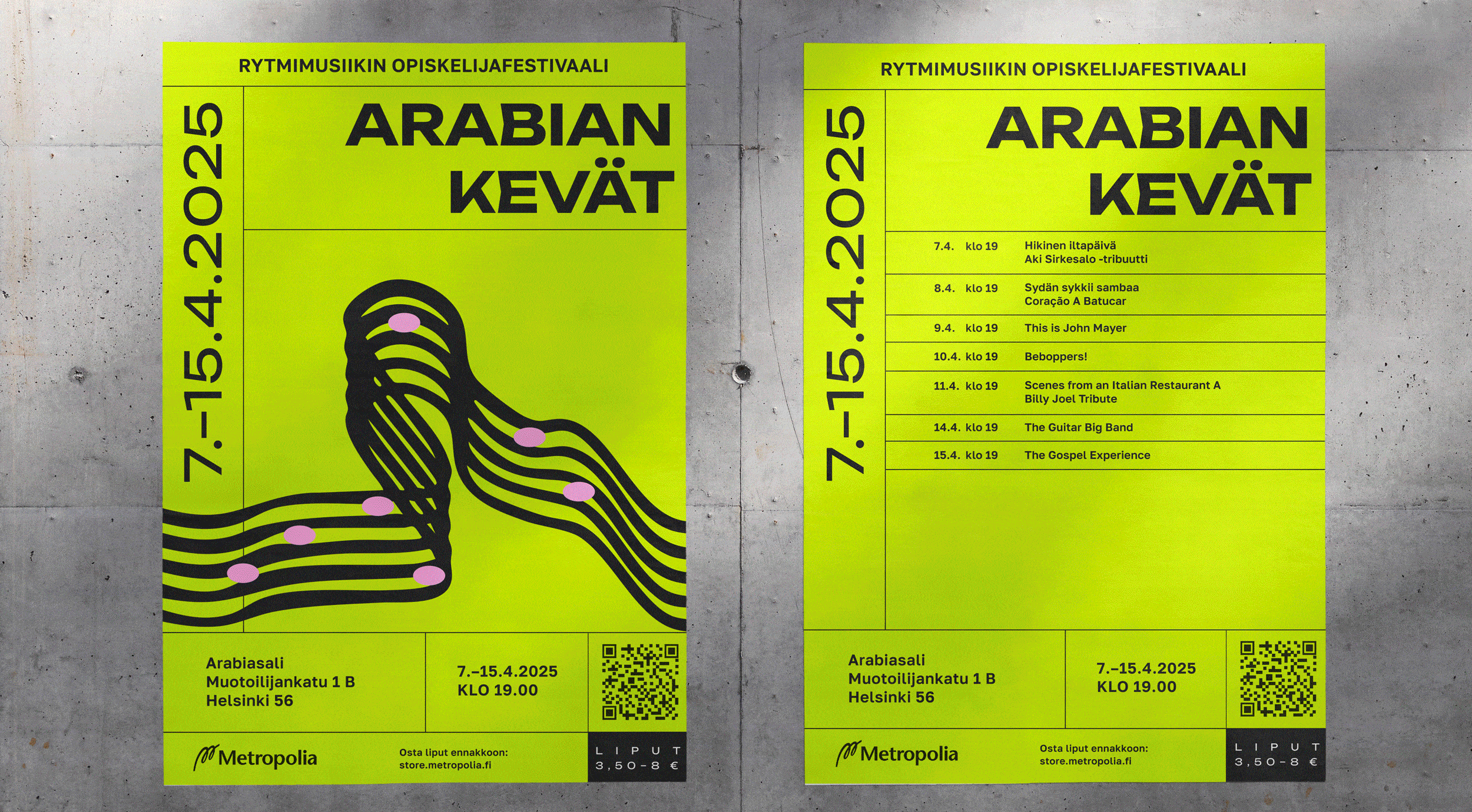
My idea was to incorporate a simple graphic element that would somehow visualize music without relying on more generic solutions such as clefs or instruments. I sketched out my ideas in Adobe Illustrator with varying levels of success — some I liked, some not so much. Having taken a short breather, I revisited them and decided to refine the sketches I liked the most. One of my initial sketches — a curved staff with chords — seemed promising and worth exploring further.
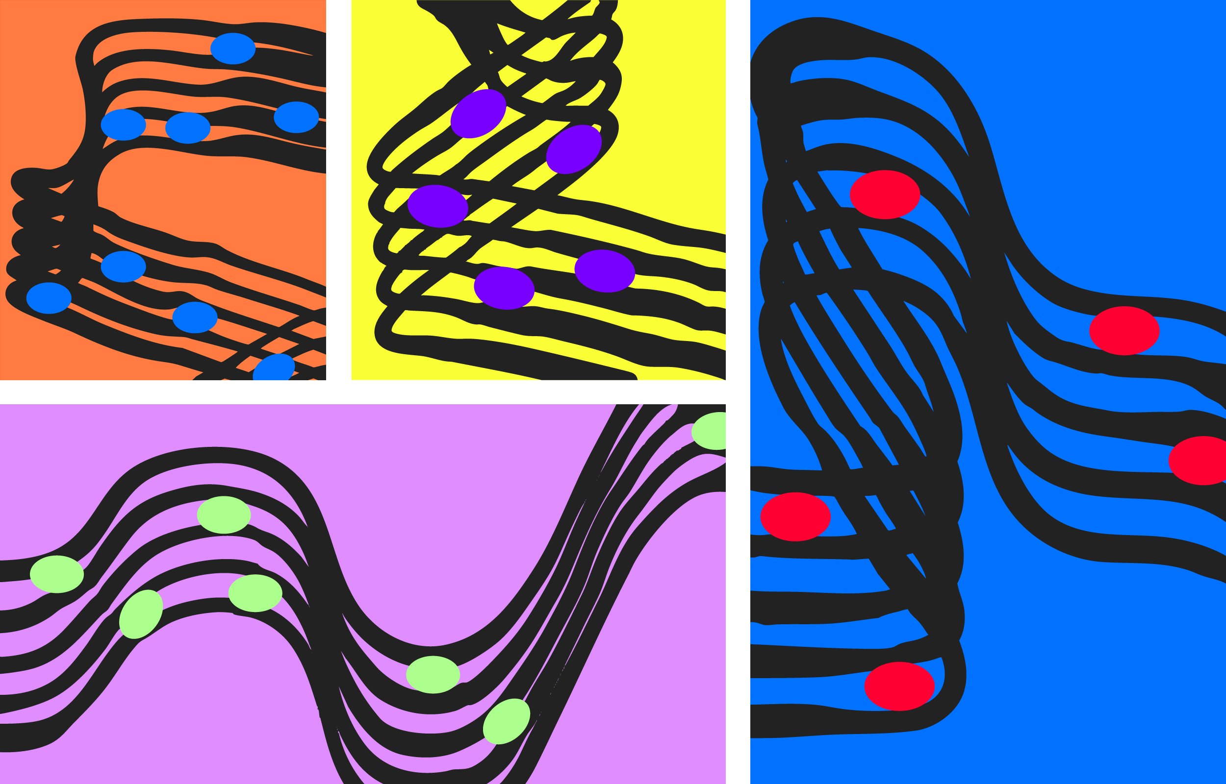
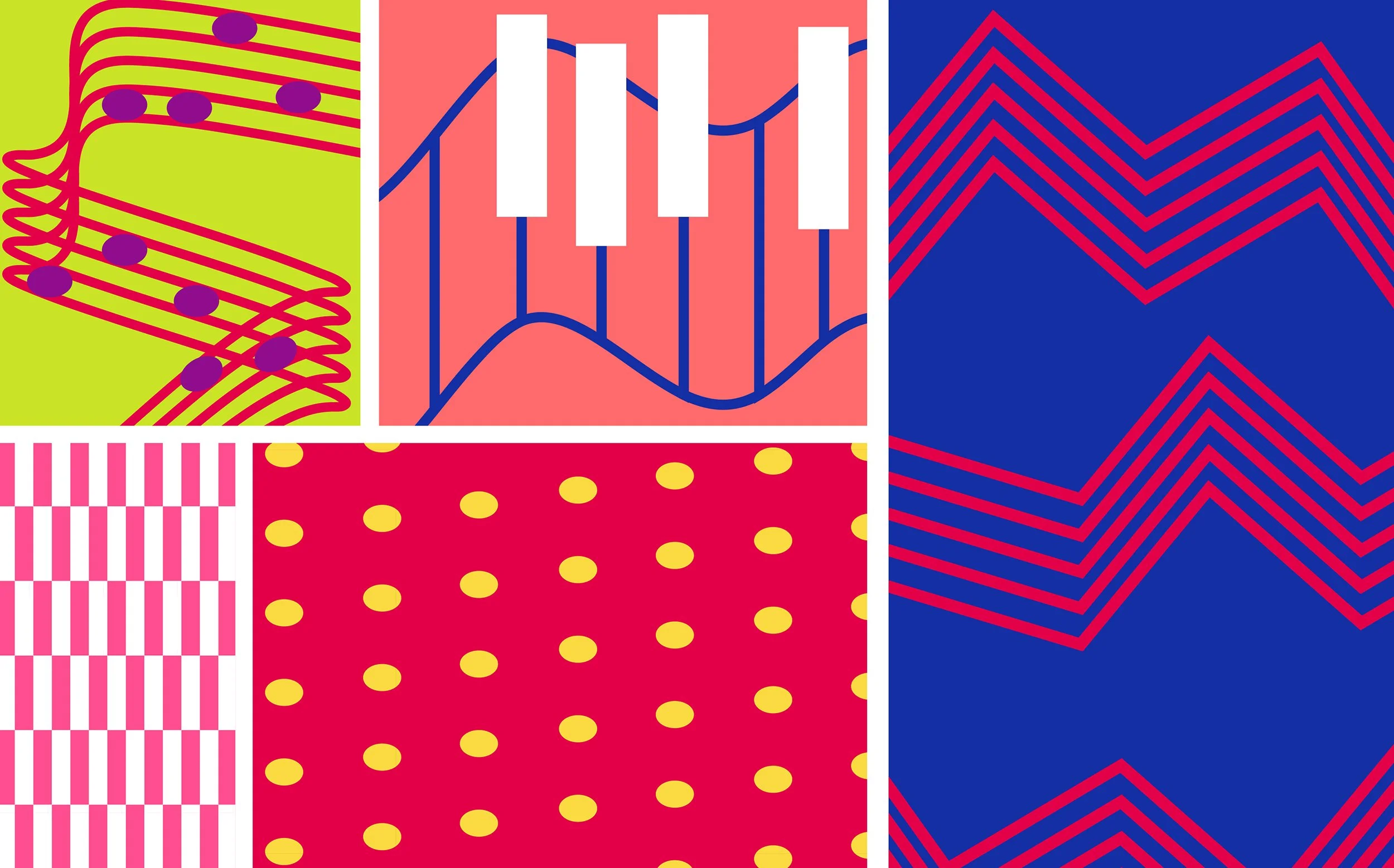
I wanted to have fun and experiment with the staff, so I brought it into Photoshop and used various tools and effects to make the lines more dynamic and imperfect. The result looks as if painted with ink and a thick brush, giving it a calligraphic feel — which I liked a lot — while also adding more personality to it.
I created several variations and played around with color palettes in Photoshop, using gradient maps and color adjustments. While I had initially struggled, I now felt like I had something of great potential. I was so pleased with the results that I was a bit nervous presenting them to the team, but thankfully both Samir and Laura also liked them a lot.
Samir had created a poster template using a modular grid, selecting Unbounded Bold for headlines and Golos Text Semibold for body text (both typefaces designed by Google). I began experimenting with integrating the graphic element into the poster, while simultaneously refining the template and typography further with Samir.
We decided that the graphic element would be the primary focus in promotional materials for concert festivals and individual concerts whenever a performer's image isn't available — while a performer's image would be paired with a secondary element, less dominant by nature.
When Laura joined us, she developed color palettes to differentiate the concert series — including contemporary and classical music festivals, club concerts, and children's concerts. She refined the tentative palettes I had initially created while sketching the graphic element, and also defined new ones.
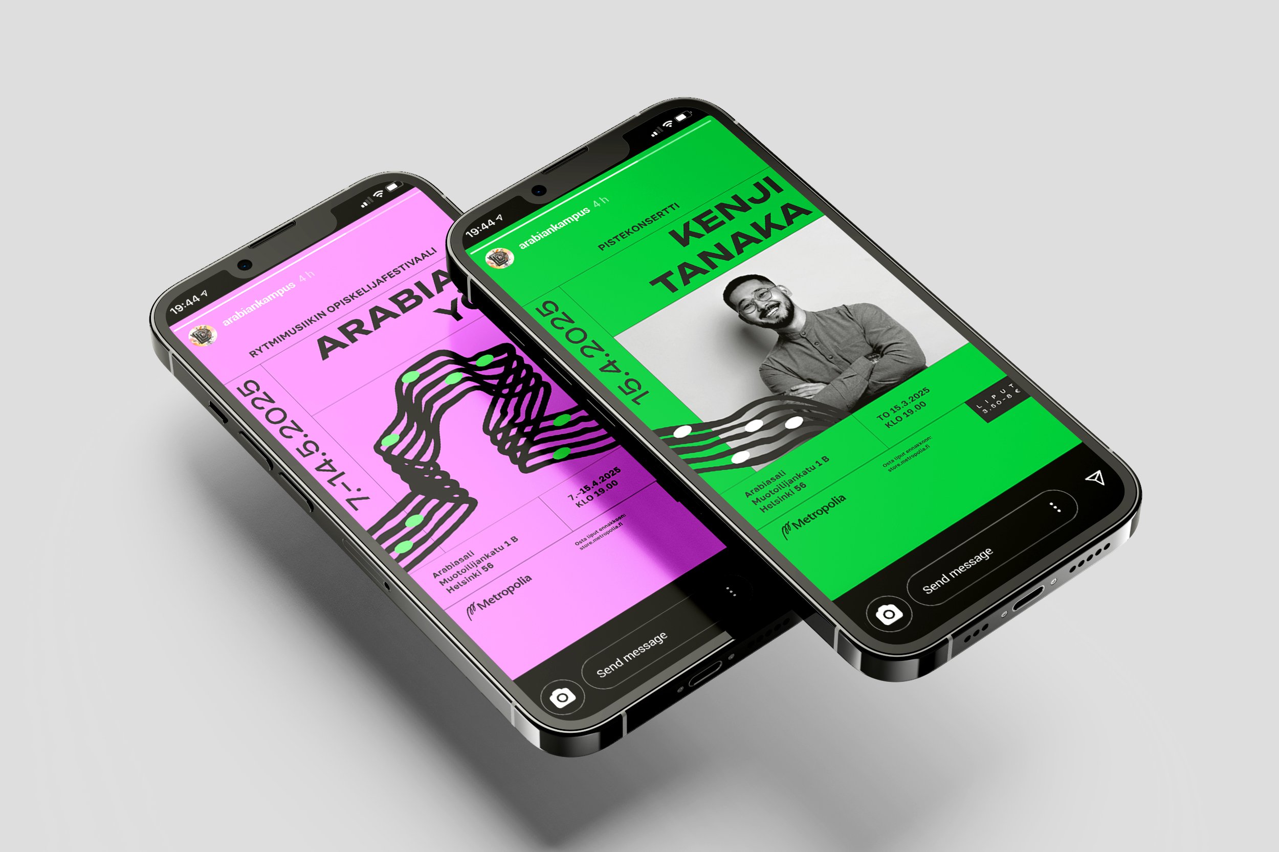
A slightly challenging aspect in creating templates for various formats — such as social media posts and screens — was the extremely strict grid system we had chosen. For example, if the text ran onto two lines, we needed to create separate templates to accommodate that.
Adobe Express was selected as the client's primary design tool, as it runs in a browser and requires minimal technical skills, using drag-and-drop tools in addition of basic editing features. Therefore we needed to anticipate every possible situation to ensure the templates would be as effortless to use as possible.
Being a music enthusiast who pays attention to the visual aspects of festivals and venues, I found designing the visual identity an intriguing challenge — how to create a professional and high-quality look that is both contemporary and timeless, while also encompassing multiple different concert series and genres?
Both Samir and I are fond of very similar aesthetics in graphic design, which helped in the critical early stages as we had to define the style we would utilize. Laura's work on the color palettes and social media templates was invaluable. Having previously worked as a team, we worked effectively this time as well, bouncing ideas and suggestions off each other in a supportive atmosphere. Reflecting on the project, we felt proud of what we had accomplished in the span of a few weeks. I believe we succeeded in the project, especially considering the project management and scheduling were largely up to us, despite the client project also being a school assignment. Additionally, I feel we took the client's potential needs and the easy use of templates into careful consideration.
The client described our concept as fresh and striking, as our teachers complimented its cohesive and strong brand. In promotional material for children's concerts, I added expressive faces to the notes, some joyfully singing — a decision that was well-received as fun and quirky.
After presenting the concept to the client in presence of our peers and teachers, our team was invited to present the project at campus event Demo as well. At the event, students from various programs — including Design, Music and Fashion — showcase their creative projects in an exhibition, along with presentations and talks on the main stage.
