PRODUCT BRANDING
School Project
2025
Software:
Adobe Illustrator
Adobe InDesign
Adobe Photoshop
Each year, students taking the Product Image and Campaign Design course develop a product brand and marketing campaign concept for a fictional juice company called Arvonen.
The company has taken pride in producing juices from ingredients grown on its own and neighboring farms, leading students to highlight the organic qualities in their branding. This time however, our class was tasked with designing a brand positioned as more premium — higher in both quality and price — than your average grocery store juice.
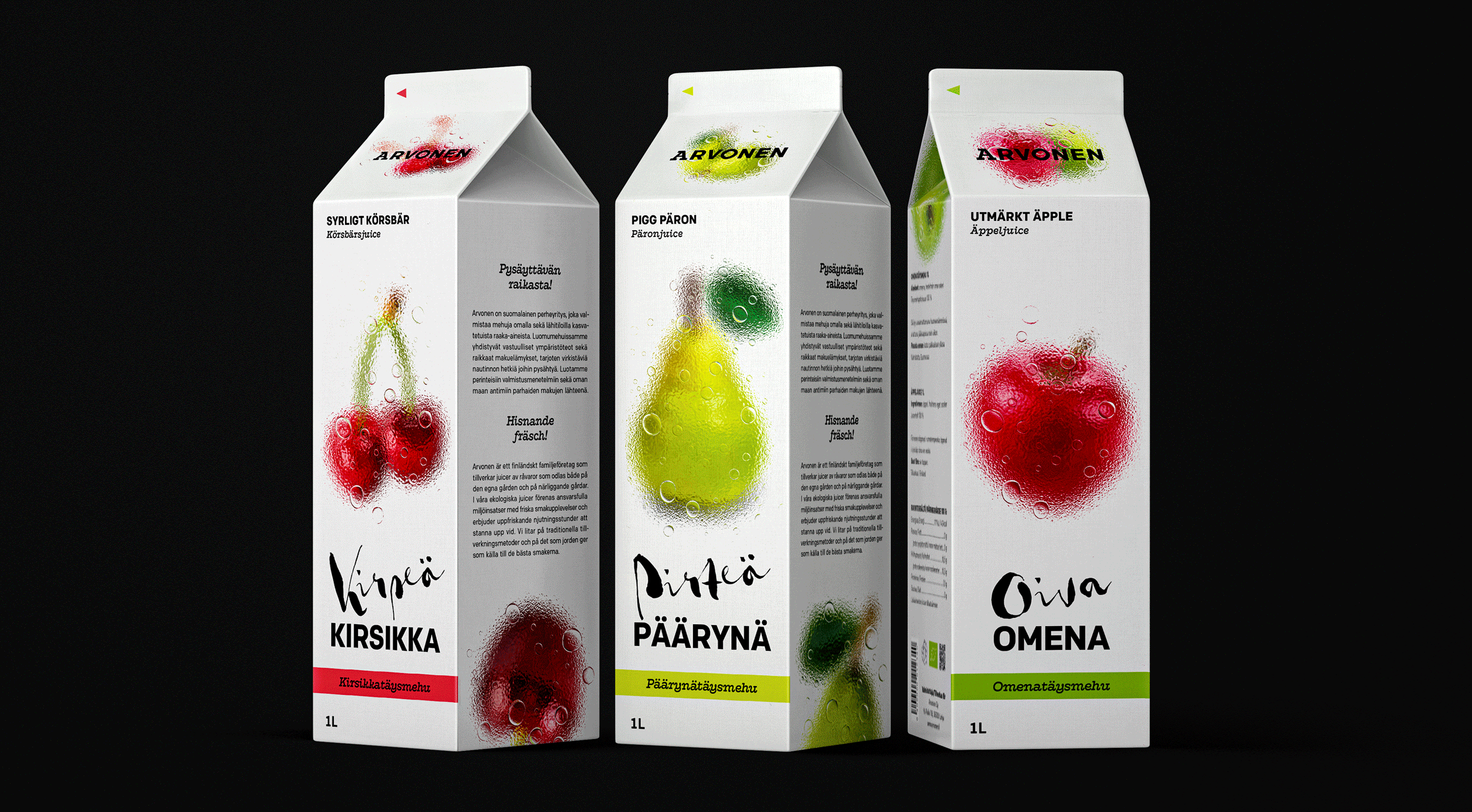
As part of the project, we created juice carton designs for three different flavors along with a concept for a marketing campaign.
Instead of beginning with designing the packages, our first task was to create a concept for a marketing campaign within a €150,000 budget. I envisioned the juices not just as drinks, but as a refreshing experience that provides moments of pleasure and revitalization even in the busiest of days — they don't only taste good but also feel good, calming the nerves and sharpening the senses.
The target audience is employed adults over 25 who value quality, responsibly sourced ingredients and good taste, and who are willing and able to choose products where the price reflects these qualities. Thus my three-week campaign plan focused on out-of-home and digital out-of-home advertising in the busiest commuter zones, and on public transportation in the Helsinki metropolitan area.

The design of the packages was entirely undefined at this point, but I aimed to highlight the freshness of the juices through imagery of fresh ingredients and drops of water in the marketing visuals — possibly incorporating the droplets in the packaging design itself, to further emphasize the freshness and to make the product more eye-catching. My aim was to create something a bit different from what is typically seen on juice cartons.
Having envisioned frosted glass in potential marketing materials earlier, I coincidentally came across images of flowers and berries pressed against frosted glass. This inspired me to experiment with a similar approach for the packaging design — I sourced stock images and tried recreating the effect in Photoshop, using effects such as Field Blur, glass filters and displacement maps. I then placed the results on mockups to see how the concept could translate in reality. Pleased with the outcome, I decided to proceed with the concept and further refine it.
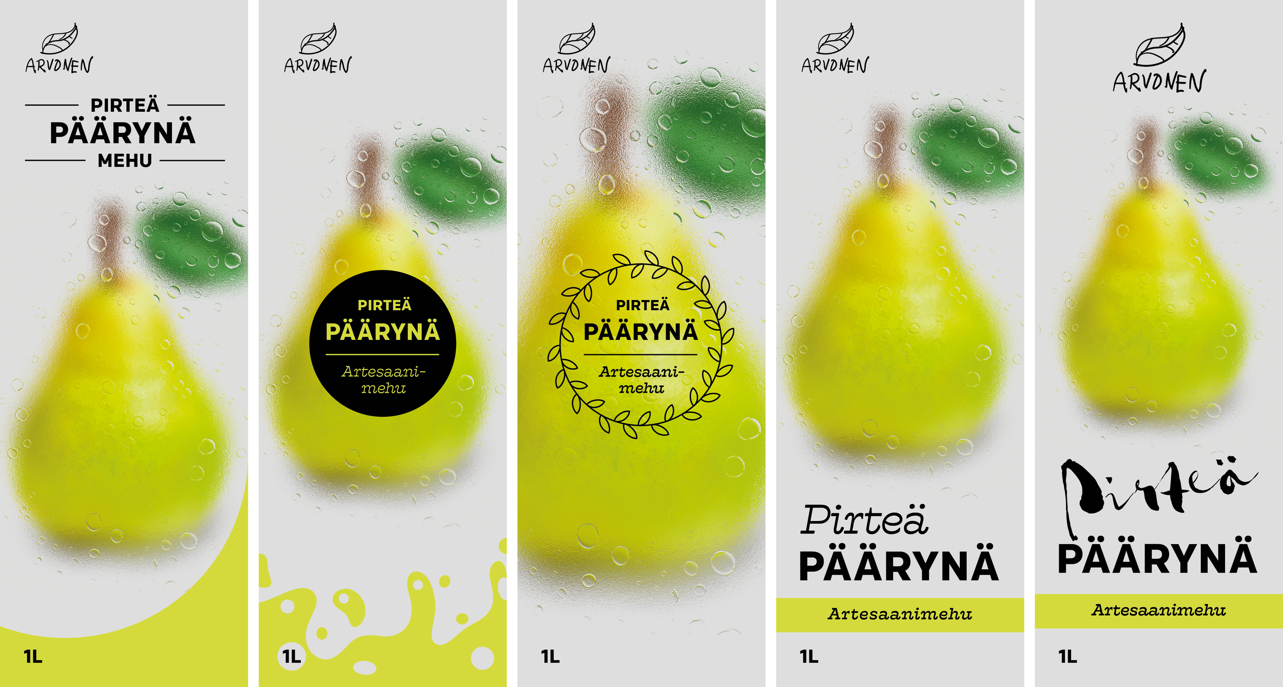
After defining the imagery, I browsed through a variety of different serif and sans serif typefaces for inspiration in typography. Additionally, I also considered incorporating a script typeface to convey the organic and handmade quality of the juices while still maintaining the premium look.
I chose sans serif typeface Colfax (designed by Eric Olson, Process Type Foundry) for the product name and body text, and slab serif Hatch (designed by Mark Caneso, PS Type) for subheadings. As I gave each flavor a name — Pirteä päärynä (‘Lively pear’), Kirpeä kirsikka (‘Tangy cherry’), and Oiva omena (‘Perfect apple’) — I used hand-lettered Gloss Drop (designed by Roland Hörmann, Phospho) for the descriptive adjective. Although nearly pushing the generally recommended fundamentals of using no more than 2–3 typefaces in a single design, I felt as though each typeface served a clear purpose and added vibrancy, personality and interest to the design while maintaining hierarchy and harmony.
For the Arvonen logo, we were tasked with designing only a wordmark logotype to keep our the focus on the packaging design. Since wordmarks of premium brands often rely on clean lines and simplicity to suggest timelessness, modernity, minimalism and luxury, I chose to use Colfax with some slightly wider spacing to reflect these qualities and to complement the typography of the packaging. To add personality and some edge, I used Hatch in letters A and O, also making the brand feel more approachable and relatable — not only do the blocky serifs bring a sense of weight and stability to the wordmark, but also suggest that the company doesn't take itself too seriously.
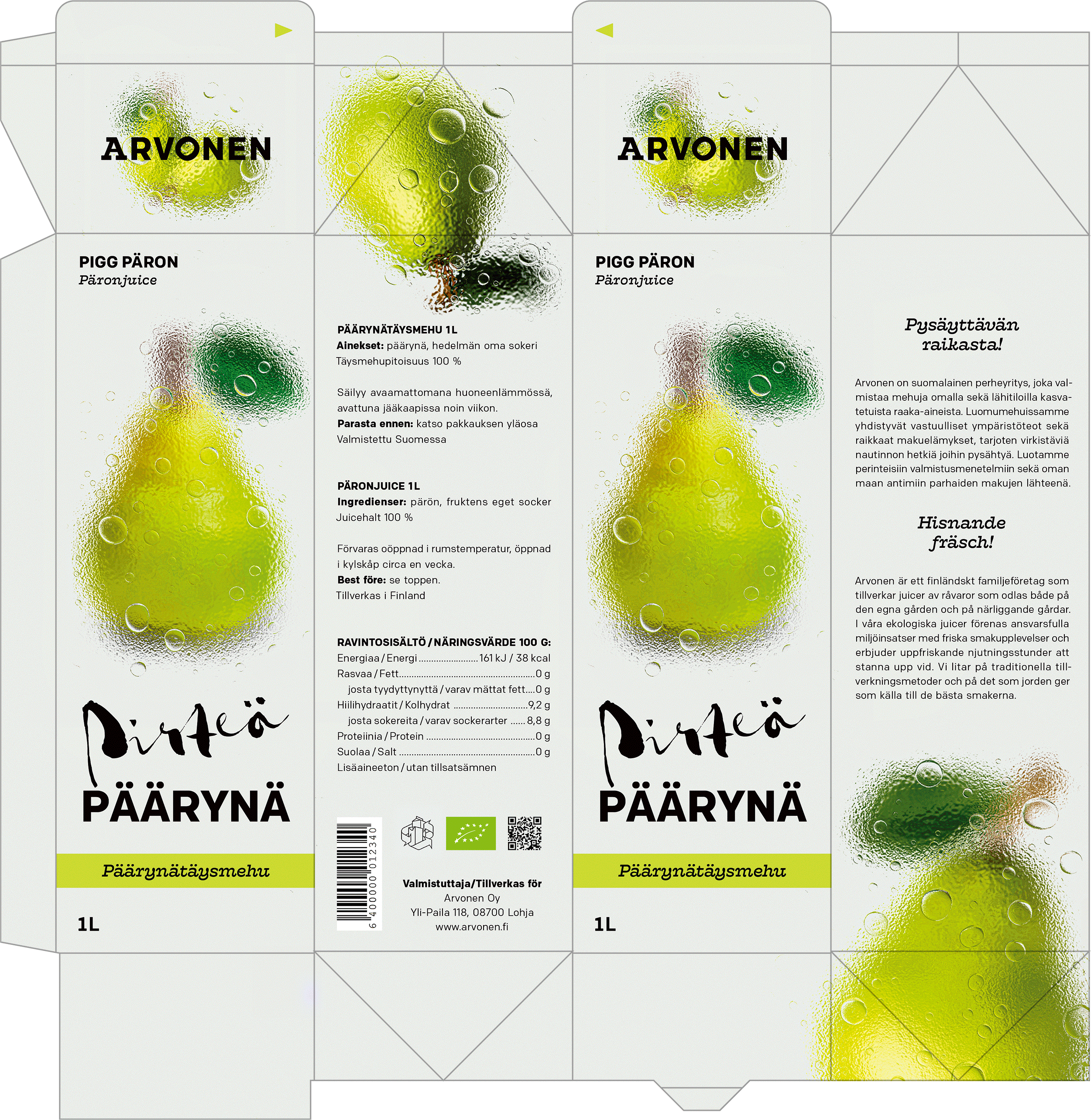
The front and back of the packaging feature the striking and vibrant visual elements, while the sides provide detailed product information, nutritional content and a brief story of the company and its values. In the last stages, I created the final graphic elements in Adobe Photoshop, refined the typography and formatted the text in Adobe InDesign, and then assembled the complete design in Adobe Illustrator.
I am very pleased with the final result, as I feel the imagery successfully conveys vibrancy and freshness while the combination of frosted glass, water droplets and white space create a striking visual impact that has great potential to be further experimented with in marketing applications. The products' premium aspect is expressed through minimalist design, carefully chosen typefaces with attention to kerning, spacing and hierarchy, and a limited color palette with a single accent color. These characteristics reflect the brand's values and premium positioning, while reinforcing recognition in consumers.
Since packaging design and product branding have interested me for years, I had especially looked forward to the project during my studies in Metropolia UAS. Designing a three-dimensional object was a refreshing challenge, taken even further by the premium aspect of the products. I feel I accomplished my aim of designing a juice carton that stands out from the usual, supported by a visual identity with a strong potential for bold and impactful marketing.